


You have done the hard part. The ad is live, the SEO is working, and the social post went out. Visitors are landing on your page. And then nothing. They scroll for a few seconds and leave.
You are not alone. The average landing page converts just 6.6% of visitors, and that number drops sharply when the page is not built specifically for lead capture. Traffic without conversion is not a marketing win; it is an expensive dead end.
The good news: the gap between a landing page that gets ignored and one that consistently generates leads is rarely about budget or design talent. It is about understanding the elements that actually drive people to fill in a form and building your page around them.
This guide walks you through every step, from defining your goal to connecting your form to your follow-up system, and shows you how CliqForms makes the whole process faster and more effective.
What Is a Landing Page, and Why Does Yours Need to Be Different From Your Homepage?
A landing page is a standalone webpage built for a single purpose: to convert a visitor into a lead or a customer. Unlike your homepage, which serves multiple audiences, tells your whole brand story, and links off in many directions, a landing page has exactly one job.
That singularity is what makes it powerful. And it is also what makes most landing pages fail: they try to do too much.
77% of businesses still use their homepage as their primary campaign landing page and then wonder why their conversion rate is low. -- KlientBoost, 2026
Your homepage is built for exploring. Your landing page is built for deciding. Every element on it, the headline, the image, the form, and the button, should exist to move one specific visitor towards one specific action. Remove everything that does not serve that goal.
Why Most Landing Pages Fail to Generate Leads
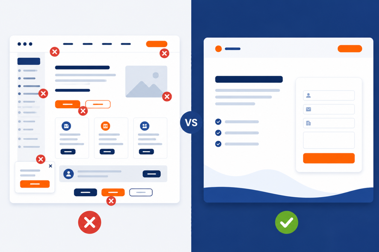
Before building, it helps to understand the most common failure points because most of them are invisible until you know what to look for.
a) Headline does not match the ad or link that sent the visitor there.
b) Too many navigation links and options that pull the visitor away from the form.
c) The value proposition is vague. Get in touch' is not a reason to hand over your email address.
d) The form is too long, asks for too much too soon, or does not work properly on mobile.
e) No social proof—no testimonials, client logos, or results—to reassure a hesitant visitor.
f) Page loads too slowly. Every 1-second delay in load time reduces conversions by 4.42%.
g) No clear next step after submitting. Visitors do not know what happens when they hit Send.
Every one of these is a solvable problem. Here is how to solve them one by one.
How to Build a Lead-Generating Landing Page: Step by Step
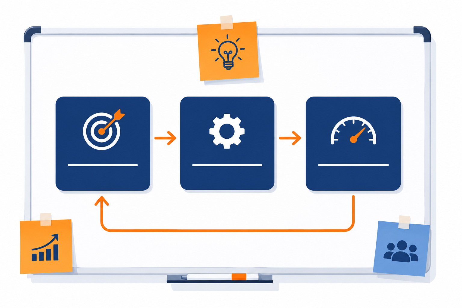
Step 1: Define One Goal and One Audience
This is the step most people skip, and it determines everything else. Before you write a word or choose a template, answer two questions: Who is this page for, and what is the single action I want them to take?
One page. One audience. One action. If you find yourself wanting to include two CTAs or serve two different customer types, build two pages. A landing page that tries to convert everyone converts almost no one.
Specific goal example: Get small business owners in professional services to book a free 15-minute demo call. That goal shapes every word, image, and form field on the page.
Step 2: Write a Headline That Does the Heavy Lifting
Your headline is the first and sometimes only thing a visitor reads. Research consistently shows a well-written headline can triple conversion rates compared to a generic one. It has to do three things in under ten words: grab attention, communicate the benefit, and confirm the visitor is in the right place.
The formula that works consistently: [Outcome the visitor wants] + [How you deliver it] + [Speed or ease].
i) Get more leads from your website without rebuilding it from scratch.
ii) Turn your contact form into a sales machine. Free to start.
iii) Book more jobs without chasing inquiries. Set up in 10 minutes.
Avoid clever wordplay that obscures the message. Clarity always outperforms cleverness on a landing page.
Step 3: Make Your Value Proposition Unmissable
Your headline hooks them. Your value proposition keeps them. This is the three-to-five-line section beneath your headline that answers the visitor's first question: What is actually in this for me?
Focus on outcomes, not features. Not only does our platform have conditional logic and webhooks, but stop losing leads to slow follow-up. Your form does the qualifying. Your CRM does the chasing.
Three to four bullet points beneath the headline, each addressing a specific benefit or removing a specific objection, will outperform three paragraphs of prose every time.
Step 4: Add Social Proof Where It Counts Most
Nobody wants to be the first. Social proof—testimonials, star ratings, client logos, or case study results—answers the silent question every visitor is asking: has this worked for someone like me?
37% of high-converting local landing pages include testimonials. Pages with social proof near the CTA consistently outperform those without. SellersCommerce, 2026
Place social proof directly next to or just above your form—not at the bottom of the page where most visitors never scroll. A single specific testimonial does more work than five vague five-star ratings.
Step 5: Build a Form That People Actually Fill In
This is where most landing pages lose leads they have already earned. The visitor read the headline, scrolled through the benefits, and decided they were interested, and then hit a form with twelve fields asking for their company revenue, job title, and preferred callback window.
The research is detailed: the ideal number of form fields for a lead capture page is four. Name, email, one qualifying question, and a submit button. Every additional field reduces completion rates—and you can gather more information later once trust is established.
What your form must do:
i) Load fast and render perfectly on mobile; more than half your visitors are on their phones.
ii) Use clear, simple field labels. 'Your name' beats 'full legal name.'
iii) Have a CTA button that says what the visitor gets: 'Get My Free Quote,' not 'Submit.'
iv) Show a privacy line beneath the email field: 'We will never share your details. 'No spam.'
v) Display a clear confirmation message or redirect after submission.
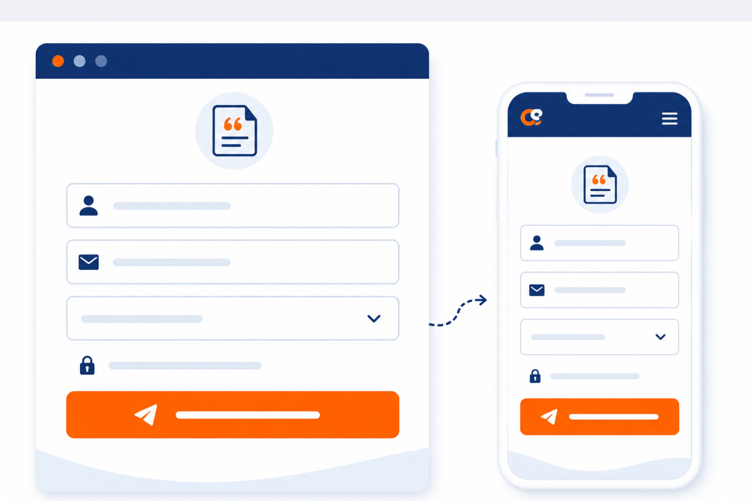
This is where CliqForms makes a genuine difference. CliqForms lets you build smart, mobile-first forms with conditional logic so the form adapts to what each visitor tells you, keeping it short and relevant regardless of the inquiry type. Built-in webhooks and Zapier integration mean every submission flows instantly to your CRM or follow-up tool, with zero manual work.
Step 6: Choose a Landing Page Builder That Does Not Slow You Down
You do not need a developer to build a high-converting landing page. But you do need a tool that gives you the right building blocks and does not compromise on the things that actually affect conversion rates.
What to look for in a landing page builder:
a) Drag-and-drop editor that does not require code.
b) Mobile-responsive by default, not as an afterthought.
c) Native form builder or seamless form integration.
d) Fast page load times—hosting and performance matter.
e) A/B testing capability so you can improve over time.
f) Analytics built in or clean integration with Google Analytics.
g) Connects to your CRM, email tool, or automation platform.
CliqForms is built specifically for businesses that need smart forms at the center of their landing page, not bolted on as an afterthought. The form and the page work as one system, so the lead journey from landing to submission to follow-up is seamless.
Step 7: Connect Your Form to Your Follow-Up System Before You Publish
A landing page without a connected follow-up system is like a sales call with no callback number. Before your page goes live, confirm:
- Form submissions trigger an instant notification to your team.
- Lead details flow automatically into your CRM or email tool.
- An acknowledgement email fires immediately to the person who inquired.
- Your thank-you page sets clear expectations: 'We will be in touch within 1 business day.'
- You have tested the full workflow end-to-end with a test submission.
Step 8: Measure, Test, and Improve
Publishing your landing page is the start, not the finish. Track these metrics from day one:
- Conversion rate: percentage of visitors who fill in the form. The industry median is 6.6%. Top 25% hit 10%+.
- Bounce rate: visitors who leave without any interaction. High bounce usually means a headline or page mismatch.
- Form abandonment rate: visitors who start the form but do not finish it. This signals friction in the form itself.
- Time on page: a proxy for engagement. Short time and high bounce together signal a messaging problem.
A/B testing increases landing page conversions by an average of 49%, yet only 17% of marketers actively test their pages. That gap is your competitive advantage. -- TrueFuture Media, 2026
Test one element at a time: headline first, then CTA copy, then form length, then social proof placement. Make one change per test; otherwise, you will not know what moved the needle.
How CliqForms Powers Your Lead-Generating Landing Page

Most landing page tools make you choose between a form tool and a page builder. Cliqforms gives you both—fully integrated, in one place.
Cliqforms includes a built-in AI-powered landing page builder that creates a complete, conversion-ready page in minutes. You describe your goal, and the AI builds the structure, messaging, and layout around it — no designer, no developer, no waiting. Every page is included in every plan, with no extras or hidden costs.
Here's what that means in practice for lead generation:
1. AI builds your page around your goal
Tell CliqForms what you're trying to achieve—book more calls, capture inquiries, or promote an offer—and the AI instantly generates a professionally structured landing page with proven conversion layouts and industry-specific messaging. You're not starting from a blank canvas or guessing at structure. The hard work is done before you've written a word.
2. Your form is built into the page—not bolted on.
Embed a CliqForms form directly into your landing page, and the two work as a single connected system. Conditional logic, mobile-first design, and instant lead delivery to your CRM all carry through seamlessly. No copy-pasting embed codes between platforms, no broken integrations.
3. Go formless when the campaign calls for it
Not every landing page needs a form. For campaigns driving bookings, clicks, or sales, CliqForms lets you go formless—with a bold, focused CTA that drives the action directly. Same builder, same AI, different conversion mechanic.
4. Edit, manage, and track from one dashboard
Every landing page you create lives in a single management dashboard where you can search, organize, update content, and track performance—without touching code. Update a headline, swap a CTA, or publish a new page for a new campaign in minutes.
5. Built to convert from the first pixel
Every page CliqForms generates is optimized for conversion—not just aesthetically pleasing. Clean design, trust-building structure, and conversion-focused sections are baked in by default, so you're not retrofitting best practices onto a template that wasn't built for lead capture.
The result: a landing page and a smart form working together as one system — built in minutes, connected to your follow-up tools, and ready to turn visitors into leads from the moment it goes live.
Frequently Asked Questions About Landing Pages
What is a good landing page conversion rate?
The industry median is 6.6%, based on Unbounce's care in 41,000 landing pages. A good rate is 10% or higher, putting you in the top 25% of pages. Top performers, particularly event registration and email-driven pages, can reach 15-20%. Always compare against your specific industry, not the global average.
How many fields should a lead capture form have?
Research points to four fields as the optimal number: name, email, one qualifying question, and a submit button. Every additional field reduces completion rates. If you need more information, use a multi-step form to spread questions across steps; visitors are more likely to finish a form they have already started.
What is the difference between a landing page and a website homepage?
A homepage serves multiple purposes: brand storytelling, navigation, product discovery, and support links. A landing page has a single goal: converting a specific visitor to a specific action. It removes navigation, minimizes distractions, and guides the visitor towards one CTA. For any campaign or ad, a dedicated landing page will almost always outperform a homepage.
Does adding a video to a landing page improve conversion rates?
Yes. Embedding a relevant video can increase the information visitors retain about your offer to around 95%, compared to roughly 10% for text alone. Research shows 39% of marketers report a positive impact on conversions from including video on their landing pages. Keep it short, 60 to 90 seconds; place it above the fold, and ensure it does not autoplay with sound on mobile.
What should a landing page thank-you message include?
At minimum: confirmation the form was received, a clear statement of what happens next, and a timeframe that sets expectations. A strong thank-you page reduces anxiety, reinforces trust, and can offer an additional action: booking a call, downloading a resource, or following on social media.
Key Takeaways
- A landing page and a homepage have different jobs. Use a dedicated landing page for every campaign.
- One page, one audience, one action. Remove everything that does not serve the single conversion goal.
- Your headline can triple conversion rates. Lead with the outcome, not the feature.
- Keep forms to four fields. Every extra field costs you completions.
- Social proof near the form, not at the bottom, is one of the highest-impact changes you can make.
- Connect your form to your follow-up system before publishing. A lead that waits is a lead you lose.
- A/B testing improves conversions by 49% on average, yet only 17% of marketers do it. Start testing now.
- CliqForms puts a smart, mobile-first, connected form at the center of your landing page, not as an afterthought.
Stop Sending Traffic to a Page That Does Not Convert
Every visitor who lands on your page and leaves without inquiring is a lead you paid to acquire in time, money, or both and then handed to a competitor.
The difference between a landing page that leaks and one that converts is not a big redesign or a big budget. It is getting the fundamentals right: a focused headline, a short form, social proof in the right place, and a follow-up system that fires the moment someone hits submit.
CliqForms gives you the form infrastructure to make that happen smart, fast, mobile-first, and connected to the tools that close the lead after the page has done its job.




.png)